
Quick answer: design the Shopify thank-you page for a thumb, not a monitor. Confirm the order first, show one offer above the fold, use a full-width CTA, two sentences of copy, and a compressed image. Build it with app blocks in the checkout and accounts editor — Additional Scripts has been view-only since August 2025, and non-Plus stores are auto-upgraded on 26 August 2026.
Reassurance first (order confirmed, what happens next). One offer with a thumb-reachable button. Two sentences of copy. Compressed image. No survey, no four banners, no chat bubble fighting the tap. Edit it under Settings → Checkout → Configurations → Edit. The one-click post-purchase page is a separate slot with its own rules. Clicks: customize the thank you page.
For most Shopify stores, the majority of orders are placed on a phone. So the thank-you page's default screen is about 390 pixels wide, held in one hand, often on cellular. Design for that first, and let desktop be the easy case.
The thank-you page is also the highest-attention screen you own. Every buyer lands on it, and they read it, because they are checking that the charge worked. Competitor guides call this a "100% view rate." Fair enough — but attention only converts if the offer is visible without a scroll fight.
The one-click post-purchase page is even more phone-native. It renders right after payment and has one job. Wallet buyers (Apple Pay, Google Pay) skip that page entirely, but they still see the thank-you screen. You need both surfaces to work in one hand. How the two differ: thank you page upsells and one-click after checkout.
Keep Shopify's confirmation and order number at the top. The shopper is checking that the charge worked. Do not hide it under a carousel.
"We'll email tracking today." That is the reassurance. Now they can look at an add-on without feeling tricked.
Product image, one-line reason, price, full-width button. If they have to swipe a gallery of six SKUs, you already lost. Pairing: personalize by product.
Survey, social links, refill reminder — below the offer, or on the Order status page, which buyers revisit later for tracking.
That revisit matters. The Order status page gets opened again when the buyer checks shipping. That second visit is a better home for loyalty sign-ups and reorder offers than the first confirmation screen.
The primary button should be full width on a phone, tall enough that a thumb cannot miss it — think the size of Shopify's own checkout button, not a text link. Put it directly under the price.
One primary action only: "Add to my order," or "Add and pay" if your thank-you block runs a second checkout. Make "No thanks" a visible text button underneath, not a tiny grey × in a corner. A decline that feels hidden reads as a trick, and tricks get refund emails.
Do not use a sticky bar that covers the order number or sits on the iPhone home indicator. If the button is half under the system bar, people think the page is broken.
If you use a countdown, keep it honest. Shopify places a temporary hold on fulfillment during a post-purchase flow anyway, so a real window exists. A fake "4 seconds left" on a confirmation page just burns trust. Platform note: product-offer docs.
Two sentences. What it is. Why it belongs with what they just bought. Then the price.
Bad: a paragraph of brand story. Worse: three headlines and a bullet novel. The buyer is done shopping. They will read a caption, not an essay. More on voice: how to write the offer.
First-time vs returning can change one noun ("spare filter" vs "next bag") without adding length. Split: first-time vs returning.
Use the product's smallest useful crop. A 2000-pixel PNG of a white bottle on white is how you make a 4G thank-you page feel broken.
Export a WebP or a compressed JPEG at the size the block actually displays. If the app lets you pick an image, do not reuse the product page's zoom file. If the image is decorative, drop it and keep the button.
We will not quote a conversion lift for "faster images." We will say slow pages get skipped. Test on your own phone with Wi-Fi off.
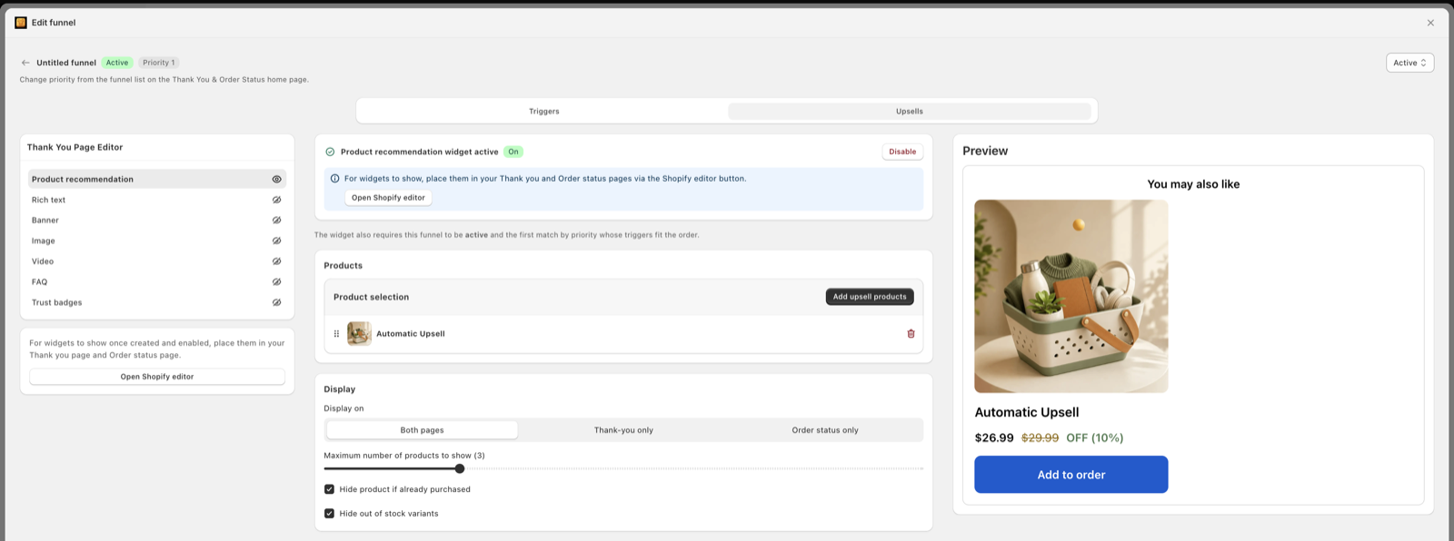
Every extra app block is a rival for the same thumb. Chat, NPS, "follow us," a second upsell, an autoplay video — pick none of those above the offer.
Shopify also will not let you restyle these pages like a theme. Blocks follow your checkout's brand settings. You control the order of blocks and a few options, not pixel-perfect CSS. Limits: checkout and accounts editor.
The Additional Scripts box went view-only on 28 August 2025. Non-Plus stores have until 26 August 2026 — four days from this update — before Shopify upgrades the thank-you and order status pages automatically, and the upgrade cannot be reverted. Anything still pasted in that box simply stops mattering. Upgrade guide: Shopify Help.
The replacement is blocks. Path: Settings → Checkout → Configurations → Edit → page selector → Thank you → Sections → Add block. Repeat for Order status — blocks do not copy over between the two pages. The one-click offer lives in a third place: Settings → Checkout → Post-purchase page.
Analytics moved too: pixels now live under Settings → Customer events, not in page scripts. Details: track upsell revenue. Full no-code setup: add a post-purchase upsell without code.
This works on every plan. App blocks on Thank you and Order status do not need Shopify Plus — Plus is only required for customizing the checkout steps before payment.
The thank-you screen is a confirmation with an optional block. The post-purchase page is a dedicated decision screen that appears after payment and before the thank-you page. Design it like a single question, not a mini-store.
On a phone that means: product, price, primary button, visible decline. No horizontal scroll of four products. Shopify allows up to three accepted offers per checkout, but three screens of "just one more" trains people to mash skip. Start with one. Funnel shape: single vs multiple offers.
Shop Pay still shows the one-click page, because it charges a vaulted card. Apple Pay and Google Pay do not. If most of your mobile checkouts are wallets, your beautiful one-click layout is invisible to them — put the same complement in the thank-you block. That is not duplicate spam if the one-click page never loaded.
COD and local delivery orders skip the page too. If you sell a lot of COD, read COD post-purchase upsells before you polish mobile CSS that never runs.
Steal the shape, swap the products.
The refill. Coffee store. Confirmation, "Roasting Thursday, ships Friday," then: bag photo, "Add a second bag of the same roast — 15% off, ships in the same box," full-width button. One decision, obvious fit.
The protector. Electronics store. Confirmation, tracking line, then a case for the exact model just bought: "Fits the Pixel you ordered." The model name does the selling. No gallery.
The starter. Skincare store, first-time buyer. Confirmation, then a travel-size of the matching moisturizer: "Most first orders add this." Social proof in five words, price under $15, one tap.
More pairings by niche: post-purchase upsell examples.
Our app. Thank-you and order status blocks plus the one-click post-purchase slot, and a cart drawer with gifts, BOGO, and volume discounts. From $9.99/mo, 14-day trial. 5.0 from 36 reviews (small sample). Built for Shopify, so it uses the editor — not Additional Scripts.
Editor walkthrough: 2026 thank-you customization. Apps: best post-purchase apps.
Show the order confirmation first so the buyer knows the payment worked. Put one offer next, with a full-width tap target in the thumb zone, two short lines of copy, and a compressed image. Remove extra widgets that push the button below the fold.
Settings → Checkout → Configurations → Edit. Use the page selector to choose Thank you, then add app blocks under Sections. Do not paste into Additional Scripts — that box has been view-only since 28 August 2025, and non-Plus stores are auto-upgraded by 26 August 2026.
No. The one-click offer appears on a separate post-purchase page after payment and before the thank-you page, controlled under Settings → Checkout → Post-purchase page. Thank-you blocks are a different surface. Design both for phones, because wallet buyers skip one-click but still see thank-you blocks.
Full width and tall enough to tap with a thumb without zooming — about the size of Shopify's own checkout button. Place it under the price, not in a sticky footer over the home indicator. One primary button; keep the decline visible but quieter.
Thank-you and post-purchase surfaces load after payment, so they cannot hurt checkout conversion. They can still feel slow on a phone if you stack five apps and huge images. Compress images and keep one offer plus a short note.
No. App blocks on the Thank you and Order status pages work on Basic and above, and post-purchase upsell apps from the App Store work on all plans. Plus is for customizing the checkout steps before payment.
Apple Pay and Google Pay orders skip the one-click page, so those buyers only see the thank-you screen. Put the same complementary product in a thank-you block so wallet traffic still gets one clear offer. Shop Pay buyers see the one-click page normally.
If you cannot tap the offer with one thumb after "order confirmed," the layout is wrong. Fix that before you touch copy. Oxify's blocks give you the one-offer layout out of the box.